

What do a Clown, an Elephant, a Rainbow and the Everly Brothers all have in common? Well not much apart from the fact that they all find themselves in Peter Blake’s Alphabet Series.
Forget ‘A is for Apple’ and ‘B is for Ball’. Peter Blake took what was universally recognised and familiar and made something entirely new and personal. Created with playful wit and curiosity, both of which are core characteristics of Blake’s work, he designed his own alphabet.
Peter Blake had a lifelong fascination with letters and typography. Words, print and imagery were always strong themes within his work, landing him, amongst other things, the commission to create the artwork for the cover of ‘Sgt. Pepper's Lonely Hearts Club Band’ by The Beatles. These themes are a playful thread throughout his career, so an Alphabet seems like quite a likely progression. His Alphabet Series features 26 Letters, each filled with unexpected images, objects and references. It is part picture book, part scrapbook and entirely Blake. It highlights the simple joy in finding something new in the familiar. However, Blake probably best sums it up, ‘I suppose I love lists, and I love things that have a beginning and a very specific ending’.

Peter Blake, L is for Love, from Alphabet Series, 1991, Screenprint in colours on wove paper
‘Love’ is one of those words that needs little to no explanation, we recognise it instantly and Blake plays on that sense of familiarity. The imagery of romance has long fascinated Blake, here the word becomes more than something we read it is something we look at. Blake is drawn to the images that circulate through everyday life, the things we collect, display and remember and attach meaning to. ‘Love’ is perhaps the most recognisable of all.
The placement of Love in an alphabet creates a kind of distance, it becomes an image, an object, and a cultural sign, rather than only an emotion. The familiar language of romance is transformed into something that we can examine. A visual for desire, memory, and nostalgia. ‘L is for Love’ is not merely a charming illustration, rather it is Blake considering how something private can become public through the images we use to represent it.
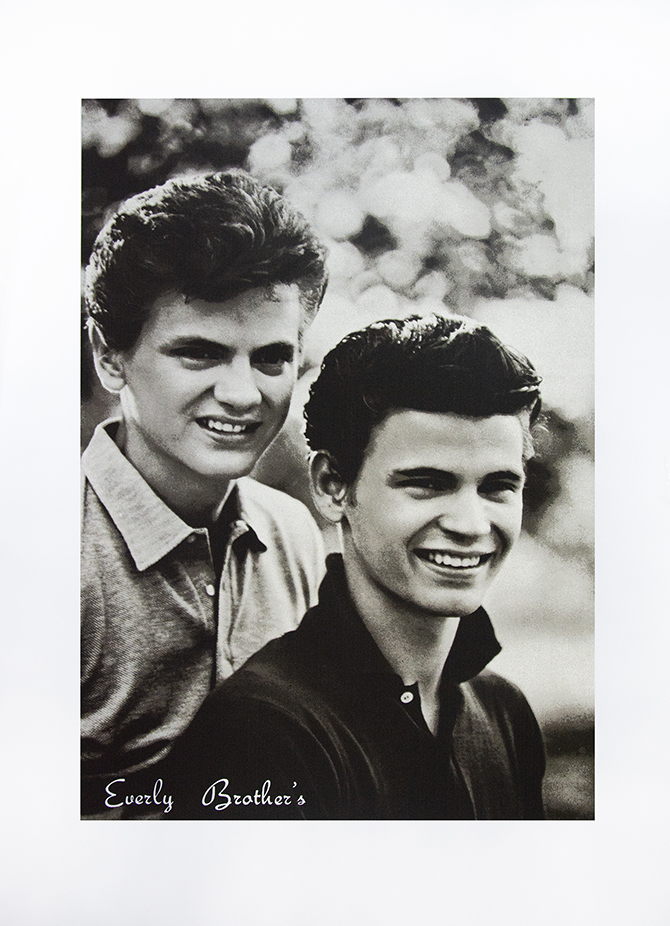
Peter Blake, E is for Everly Brother's, from Alphabet Series, 1991, Screenprint in colours on wove paper
Focusing away from ‘Love’, we can look towards music and the print ‘E is for Everly Brother's’. The choice feels particularly fitting for Blake, whose work surrounded itself with popular culture. The Everly Brothers were a defining musical duo of the 50s and 60s. Blake captures them within his alphabet series as another fragment of popular culture. It is this mix of art, music and memory that makes the alphabet so distinctly Blake.

Peter Blake, P is for Pachyderm, 1991, Screenprint in colours, on wove paper
When considering the letter ‘P’, the list of images that could accompany it seems endless: ‘Pop’, ‘Picasso’, ‘Piano’… but I bet ‘Pachyderm’ was not a word that sprung to mind right away! The word is unusual and feels of another time, evoking a sense of nostalgia, perhaps something seen in a children’s story book.
It is this purposeful selection of the unexpected which makes Blake’s ‘Alphabet’ images so enjoyable. His letters are not simply illustrations designed to teach us our ‘ABCs’, they are a collection of peculiar associations, tailored to surprise and delight.
View the Summer Show until September 13th 2026
