Shapero Modern's art blog unpacks the world of modern art through editorial content, specialist selections, market news, and collecting guides.
-

-
-
Happy birthday to David Hockney
born on 9 July Jul 9, 2025 -
Spotlight on: Takashi Murakami
Turning traditional into contemporary Jul 3, 2025 -
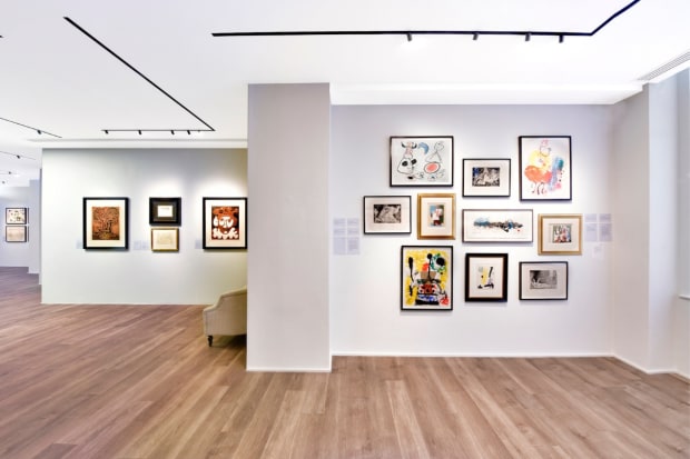
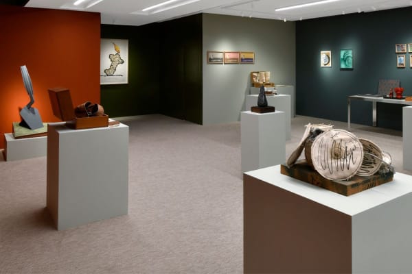
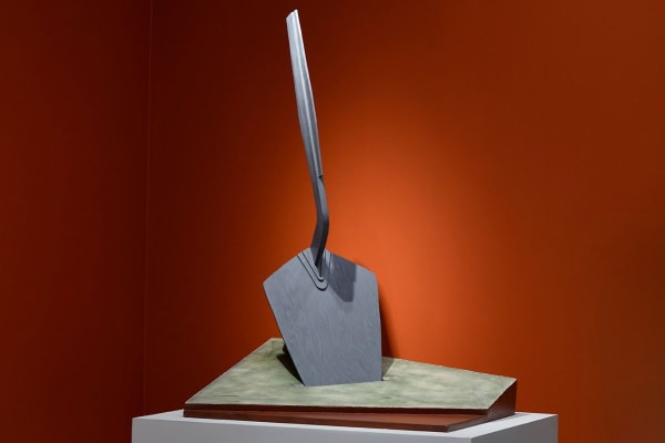
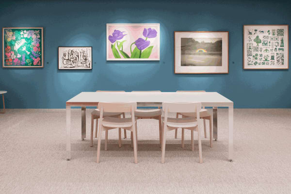
Summer Exhibition 2025
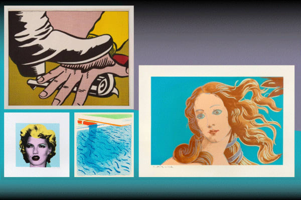
The Pop Art movement and its evolution into the present day Jun 13, 2025 -
Icons of Pop Art
The revolutionary artworks of four icons of American Pop Art Jun 2, 2025 -
Making the Mundane into the Monumental
Turning the Everyday into the Colossal May 29, 2025 -
ARTIST SPOTLIGHT
5 Fascinating Facts about Claes Oldenburg May 22, 2025 -
NOW OPEN | Claes Oldenburg: Multiples
The first London exhibition of Oldenburg's Multiples May 8, 2025 -
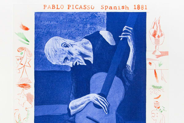
Modern Spanish Printmakers
The visionary works of Spain’s modern masters Apr 10, 2025 -
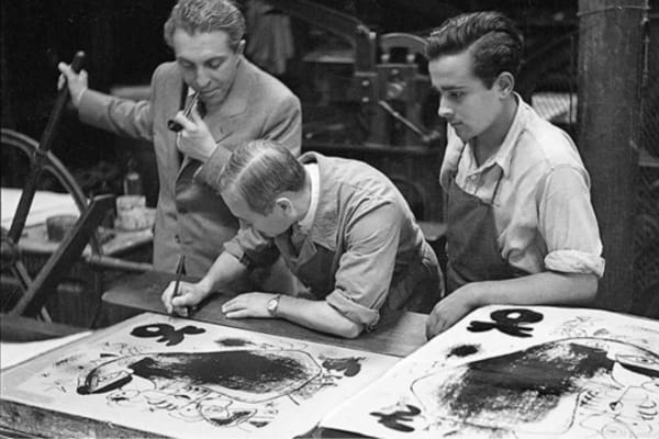
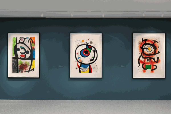
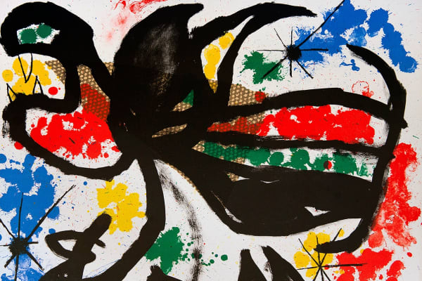
Joan Miró: Monumental Printmaking
Groundbreaking prints by the Catalan Spanish artist Apr 2, 2025 -
Power of Colours | Mylands X Shapero Modern
In Collaboration with Interior Designer Beata Heuman Feb 11, 2025 -
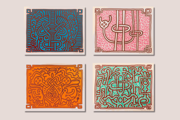
Keith Haring’s ‘Chocolate Buddha’ Series
Art & Activism Feb 8, 2025 -
Gary Hume's 'The Sister troop Portfolio'
Abstracting the iconic American cheerleader Jan 30, 2025 -
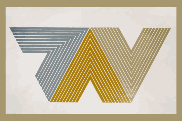
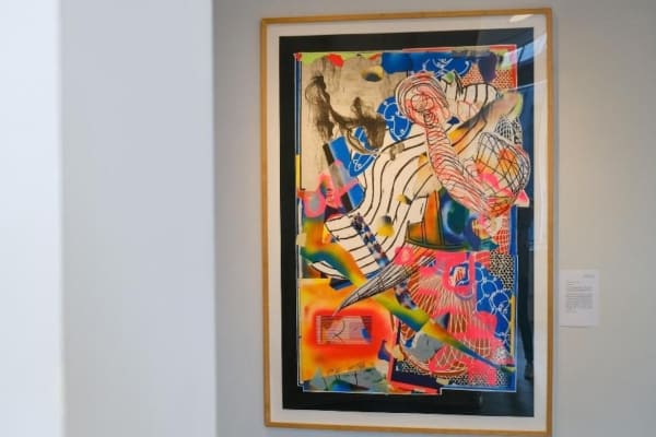
Frank Stella's 'V Series'
The Geometric Chevron Designs Jan 23, 2025 -
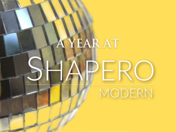
A Year at Shapero Modern
Looking back on 2024 December 28, 2024 -
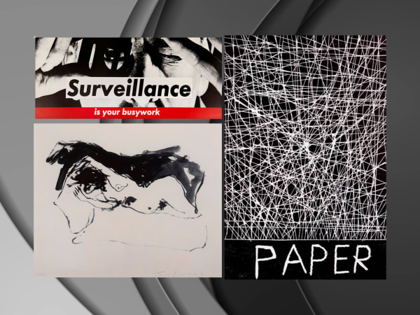
In Monochrome
Barbara Kruger, Tracey Emin, and David Shrigley December 20, 2024 -
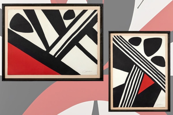
Alexander Calder's Printmaking
Two fine examples of Calder’s take on futurism. December 5, 2024 -
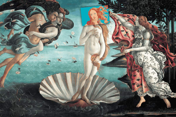
Details of Renaissance Paintings at Art Miami 2024
Discover Shapero Modern's take on renaissance paintings November 21, 2024 -
Accessible Artworks
Accessible Artworks How you can own a piece of art history and enrich your collection with timeless works of art... November 16, 2024 -
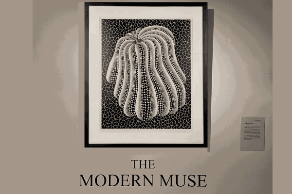
The Modern Muse | CURRENT EXHIBITION
A New Era of Inspiration October 29, 2024 -
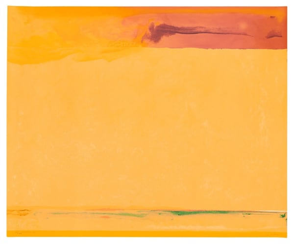
The Spaces of Helen Frankenthaler
February 15, 2024 -
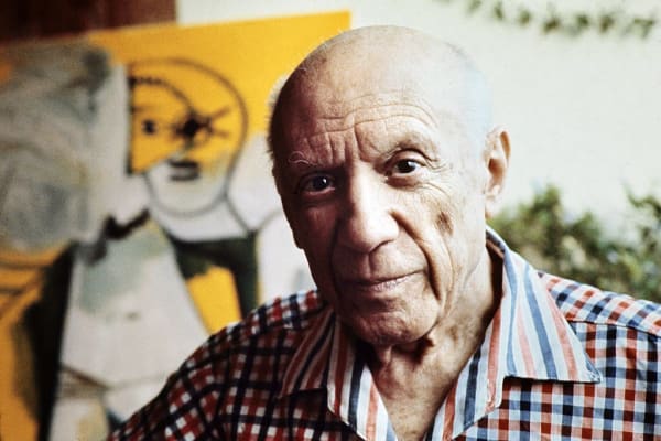
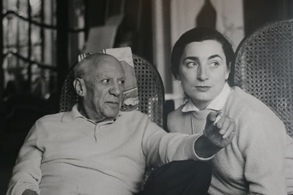
Picasso: The Places That Defined Him (Part 1)
May 3, 2023 -
Picasso: The Places That Defined Him (Part 2)
May 24, 2023 -
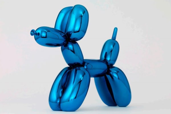
Visitor breaks iconic balloon dog sculpture in Miami
February 20, 2023 -
Andy Warhol's Blotted Line Drawing
February 6, 2023 -
Frank Stella: The Waves
November 29, 2022 -
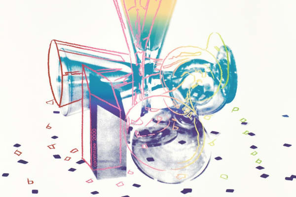
#WarholWednesday - Committee 2000
September 14, 2022 -
Jasper Johns | Process and Printmaking
September 12, 2022 -
Summer Show 2022 | Joan Miró
August 10, 2022 -
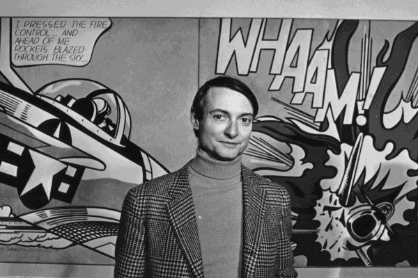
Summer Show | Roy Lichtenstein
August 10, 2022 -
Pablo Picasso
July 14, 2022 -
Intaglio Printmaking
-
Summer Show 2022 | Tunji Adeniyi-Jones
July 8, 2022 -
Summer Show 2022 | Frank Stella
July 1, 2022 -
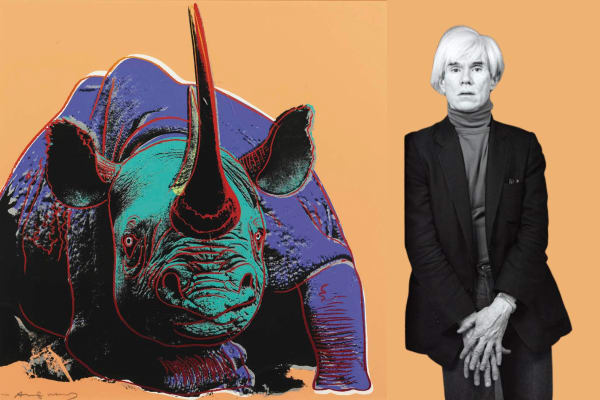
#WarholWednesday - Black Rhinoceros
June 15, 2022 -
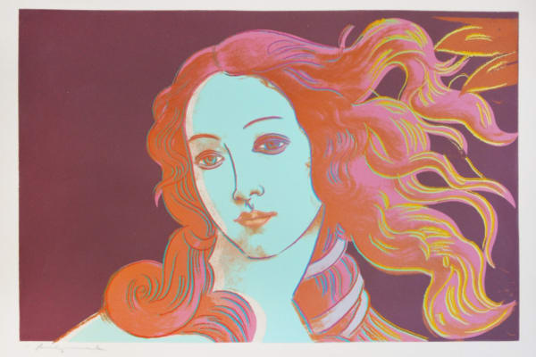
#WarholWednesday - Birth of Venus
June 8, 2022 -
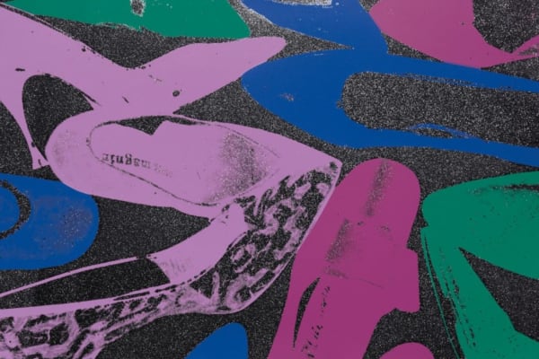
#WarholWednesday - Shoes
June 1, 2022 -
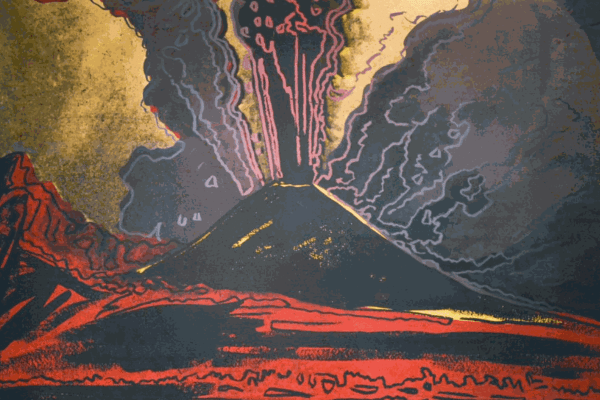
#WarholWednesday - Vesuvius
May 25, 2022 -
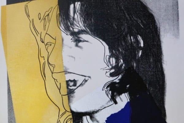
#WarholWednesday - Mick Jagger
May 20, 2022 -
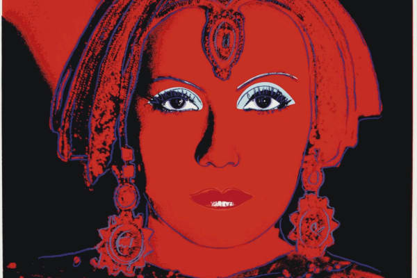
#WarholWednesday - The Star
May 13, 2022 -
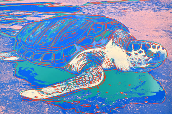
#WarholWednesday - Turtle
May 4, 2022 -
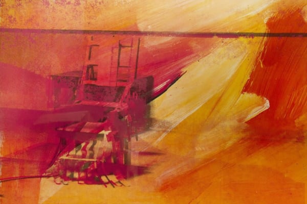
#WarholWednesday - Electric Chair
April 27, 2022 -
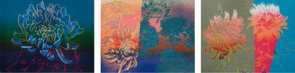
#WarholWednesday - Kiku
April 20, 2022 -
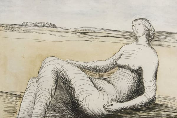
Henry Moore: Shaping an Artist
November 8, 2021 -
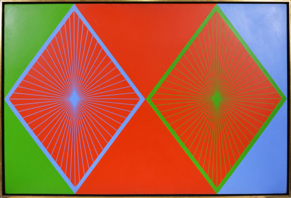
Op Art in Three Acts: France, England and United States
Victor Vasarely, Bridget Riley and Richard Anuszkiewicz July 21, 2021 -
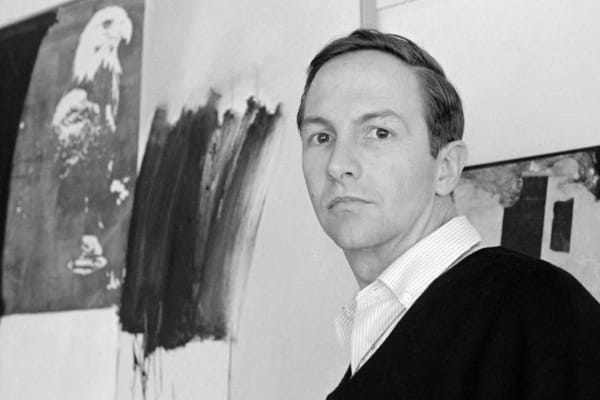
Robert Rauschenberg Facts: Five Things to Know
July 5, 2021
-
-
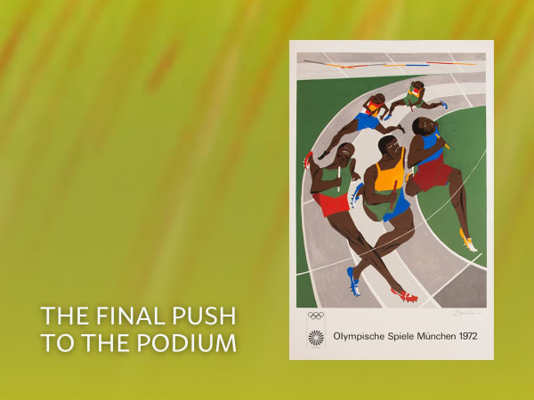
Summer Show 2024
30 Olympic Posters by 28 International Artists from the 1972 Olympic Games