
1. Victor Vasarely

Victor Vasarely (1906-1997) was a pioneering artist in Op Art. He began his journey towards abstraction at the Muhely Academy in Budapest, strongly influenced by artists like Herbin, Mondrian, and Le Corbusier. Vasarely's innovative grid-based system allowed endless permutations of forms and colors, earning him the title 'father of Op Art'. His paintings create a sense of movement and depth through clever use of lines and changing colors. Among his notable series is Gestalt, showcasing his fascination with the hexagon. Axo 99 exemplifies his mastery of sculpture, vibrant colors, Op Art, Cubism, and Surrealism. Explore Vasarely's mesmerizing world of geometric wonders and illusions.

Bridget Riley, the renowned Op Art artist, began her artistic journey in the swinging sixties. Her black and white paintings, featuring geometric shapes, captivated the art world. The Responsive Eye exhibition in New York catapulted her to fame, making her Britain's art celebrity.
Over time, Riley introduced vibrant colors and stabilized forms to her work, creating a sense of movement and illusions. Her curve paintings exude tranquility, while her visit to Egypt inspired a shift to free color organization.
Today, Riley's art focuses on pure visual sensation, treating form and color as distinct entities. Experience the enchanting world of Bridget Riley's mesmerizing masterpieces, where colors and shapes dance in harmonious delight.

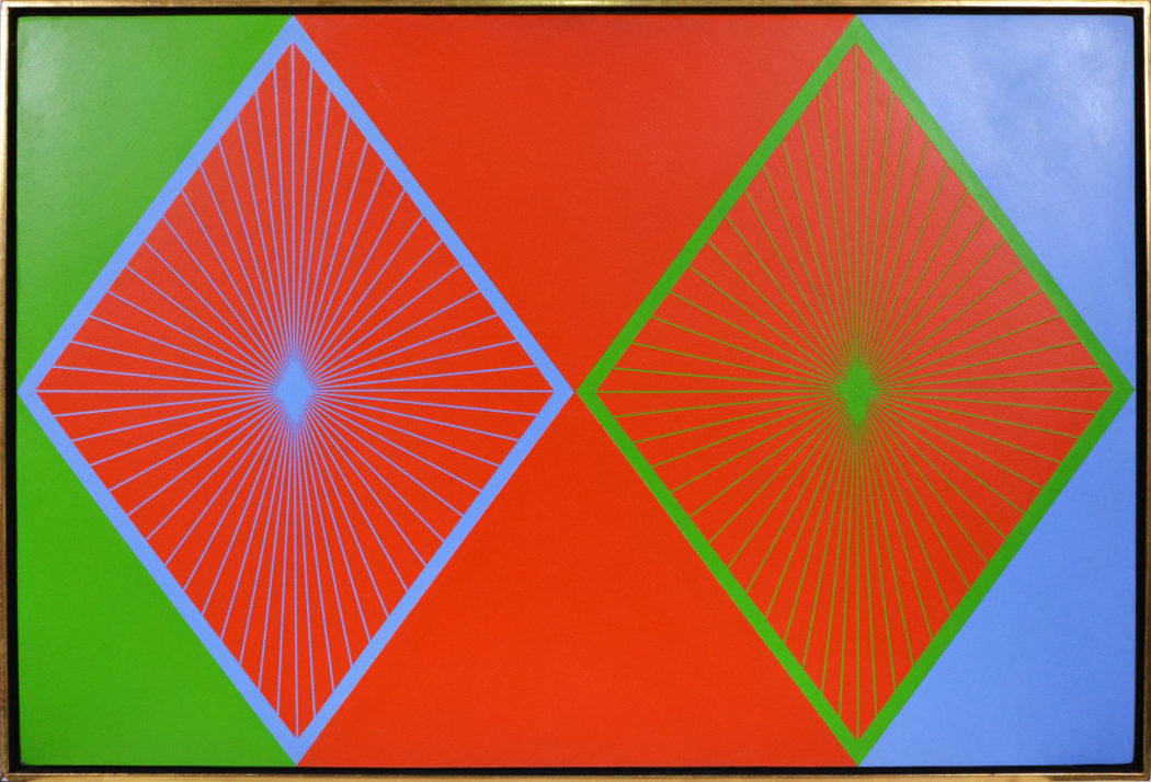
Richard Anuszkiewicz (1930-2020) is an iconic Op Art painter known for his vibrant geometric compositions. He explored the effects of intense colors, creating visually captivating works that played with light and perception. Inspired by architectural marvels, his Temple Series showcased the interplay of color and light. Anuszkiewicz's art, meticulously planned and skillfully executed, leaves a lasting impression, blending art and science to captivate viewers. Step into his extraordinary world of illusions and wonder..

* denotes required fields
We will process the personal data you have supplied to communicate with you in accordance with our Privacy Policy. You can unsubscribe or change your preferences at any time by clicking the link in our emails.